Thanks for the info and help Dave!
This Photo was taken by Nancy Pants Robinson. I am a sucker for Black and White Photography and absolutely love this photo. She did a fantastic on this one. The rule of third applies here with the boat. It is off to the left but is definitely the focal point and your eyes is easily drown to it. The Photo was take very low to the ground to allow the boat to be brought up to the center. The dock in the shot really draws your eye out to the boat and then on into the rest of the photo. Being that this photo was taken in the fog, the black and white was a great choice. I love how the water is calm enough to be able to see the reflection of the trees in the foreground and how the fog natural causes the photo to stop. The rocks at the bottom provide a great presence to the photo. Absolutely fantastic, I WANT THIS PHOTO! Good work NANC!
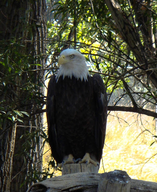
This photo was taken by Uncle Bill Bender. Out of all the wildlife photos I have seen produced by this class this one is definitely one of my favorites. While the rule of thirds isn't to present in this photo, it still manages to just work. The eagles head is cocked off to the side allowing good detail into his eye. The colors appear to be very good and natural. If had to say anything negative about this picture is that the grass behind the eagle appears to be very bright, which could have possibly been changed by adjusting the exposure. Also there is a fence in the background that is just a little annoying, but not much can be changed about that. All in all I really like this photo. Excellent work Billy Boy!
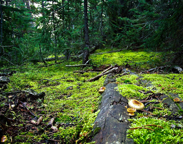
This photo was taken by Cody "Codes" Halverson. I really the color contrasts in this photo. On one end you have a very vivid green, and on the other very dark greys and blacks. The logs on the ground draw your eye well into the picture. I also like that this picture does not have to much sky at all. Sky works well in a lot of pictures, however with this one, I feel sky would have drowned the picture out and made it to overwhelming for the viewer. Good Work Codes!
This photo was taken by Anton Larsson. I really love what you did with this one. The lake is pristine allowing for a great reflection. The reflection in itself is great because you didn't match the sky to ground ratio. There is much less sky in the reflection then there is above the actual mountains. This makes the photo I feel, because your not looking for the perfect symmetry, you really what odd numbers and things offset which you have done well in this photo. I do like that the mountains are some distance away and you have managed to keep the noise to a minimum. The colors work very well with this shot as well and are very natural. Great Job!
This photo was taken by Zach "Big Z" Witt. This a great shot of a mountain goat, ha! just kidding. This Big Horn Sheep is very photogenic. I like what you did with the editing here to help bring out the greens and well as the browns. The amount of detail that this photo has is astonishing and with very little, if any, noise. The way the sheep's head is cocked really draws you in the sheep's clearly defined eye. Overall very good work with this photo.
This photo was taken by Nathan McKenty. In one word, WHOA! Not so much in a good way. The point, at least as far as I know, of digital nature photography is to make things look as natural as possible. This photo is a horrible example of that as I am not entirely sure as to what I am looking at, Im assuming the moon, or possibly the sun? This photo in my mind displays no artistic ability, especially since you have some good photos. Why you would choose to add this photo to your 30 pictures is beyond me and I feel it really brings your whole final project down. Not a Fan!
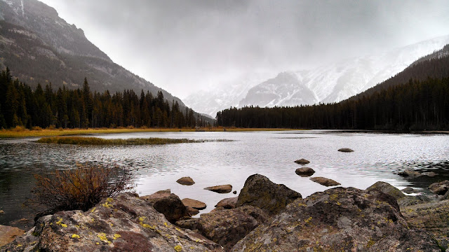
This photo was taken by Riley Boyd. I really like this photo. You really lucked out with weather on this one. Yes, sunny and 75 photos are fantastic but I love when there is a little weather to shake things up a little bit. Like Nancy's photo, the photographer was very low to the ground in this shot which allows the viewers to get and idea of the shear size of the mountains around the photographer. I also love how there is a gap in the rocks that lead to the lake that then leads into a gap in the trees and then on into the mountains. I also love how the clouds and precipitation naturally end the photograph for you. Colors in this photo are very vivid and make the picture look very natural. Very nice job Mr. Boyd!
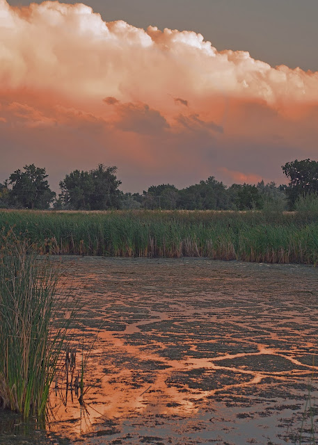
This photo was taken by Noah Kiprono: This photo is very interesting because the location says Fromberg, Montana, but one would believe just by looking that its from the plains of Africa. I really like this photo, it really gives and idea of weather and manages to make it look sinister as I am sure it was under those clouds. The picture is very warm, almost to warm but I think you manage to make it work. It looks as though it was taken on a very warm summer evening before the weather began to turn. Very nice job, Noah!
This photo was taken by Cole Broadus. This photo is what everyone thinks of when they hear the word mountains. The green grass and the white peaks really compliment each other. I also like how there is more sky then ground giving it an "eye-level" feel. The gap in the trees does a very nice job of drawing the viewers eye up into the mountains. Your colors appear very natural. If I had one comment, it would be to try and see if you can pull the blue out of the sky a little more, its just a little washed out and hard to see the magnificent clouds above the mountains. All in all a really nice photo.
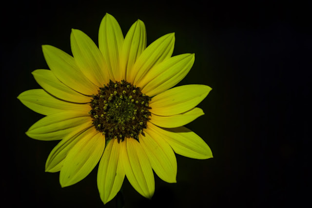
This photo was taken by Jon Brunn. When you presented this photo to the class I was amazed to find out that it was taken outside in the wild. I was sure that you cut the top of the flower off and set it on a black background. I think you did a very nice job of keeping the color of the flower, its a little washed out with the light of your phone. You did a really nice job with the rule of thirds by off setting the flower to the left. I love how there are no distractions and that it is just pure flower. Very good job!




No comments:
Post a Comment